Colour management system
- 1.1 Colour spaces
- 1.2 Core palette
- 1.3 Additions and why each exists
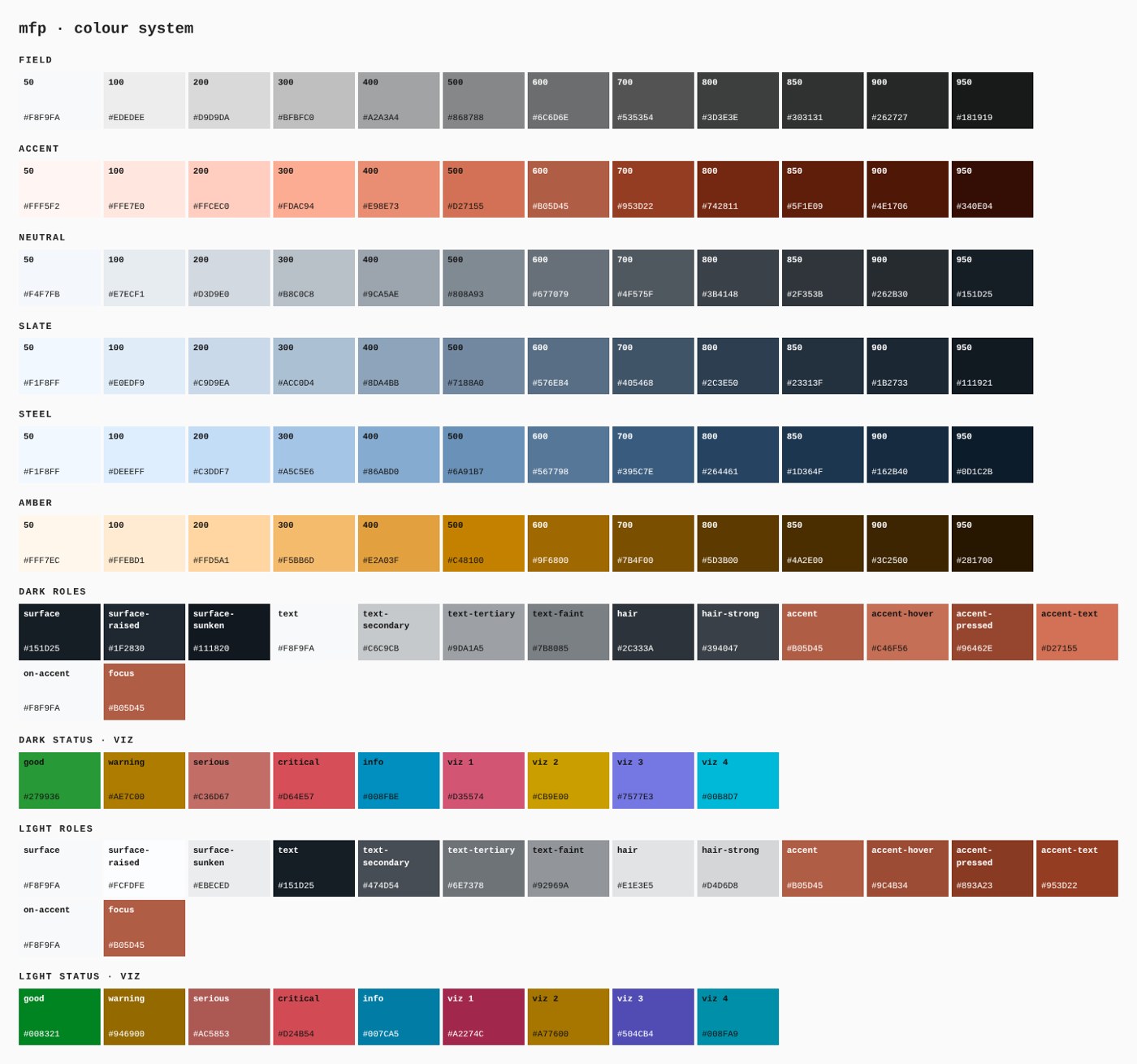
- 1.4 Ramps
- 1.5 The second mode
- 1.6 Status set
- 1.7 Data-visualisation set
- 1.8 Contrast matrix (light mode)
- 1.9 Print colour
- 1.10 Usage ratios
The colour law: paper is the room, slate is the frame, ink is the voice, terracotta is the one thing to do.
1.1 Colour spaces
Author in sRGB hex. Ramps were derived in OKLCH so that steps are evenly spaced to the eye. CIELAB values are given for print matching. CMYK values are starting builds computed without a printer profile; proof them before a run.
1.2 Core palette
| Token | Hex | RGB | OKLCH (L C h) | CIELAB | CMYK start | Role | Production? |
|---|---|---|---|---|---|---|---|
field-50 |
#F8F9FA |
248 249 250 | 0.982 0.002 248 | 98 -0 -1 | C1 M0 Y0 K2 | Paper: the page | measured, 38.0% of painted area |
slate-800 |
#2C3E50 |
44 62 80 | 0.356 0.039 249 | 25 -2 -13 | C45 M22 Y0 K69 | Slate: header, hero, bands | measured, 6.9% of painted area |
accent-600 |
#B05D45 |
176 93 69 | 0.571 0.114 37 | 49 32 29 | C0 M47 Y61 K31 | Terracotta: the accent | measured, 2.2% of painted area |
accent-700 |
#953D22 |
149 61 34 | 0.475 0.125 37 | 38 35 34 | C0 M59 Y77 K42 | Terracotta as text; small filled buttons | derived |
steel-600 |
#567798 |
86 119 152 | 0.557 0.064 249 | 49 -3 -22 | C43 M22 Y0 K40 | Steel: charts, quiet graphics | measured, 23.2% of text length |
amber-400 |
#E2A03F |
226 160 63 | 0.753 0.135 73 | 71 16 58 | C0 M29 Y72 K11 | Amber: review stars only | measured |
Ink is #151D25 (measured: 25.9% of text length, 8.6% of painted area). It is the text role in light mode and the surface role in dark mode.
1.3 Additions and why each exists
| Token | Value | Why |
|---|---|---|
text-secondary |
#474D54 |
Body copy that is not the main statement; 8.11:1 (AAA) on paper |
text-tertiary |
#6E7378 |
Replaces the two pale greys that failed contrast; smallest ink mix that clears 4.5:1 on paper (4.54:1 (AA)) |
accent-text |
#953D22 |
Terracotta is 4.43:1 (large text / non-text only) on paper, so terracotta text uses this darker step (6.71:1 (AA)) |
alias-accent-on-band |
#D27155 |
Terracotta kicker text on slate |
alias-accent-strong |
#953D22 |
Fill for buttons whose label is under 19 px bold |
alias-band-deep |
#1B2733 |
Under hero photographs and the footer |
1.4 Ramps
Slate (production value pinned at 800):
| 50 | 100 | 200 | 300 | 400 | 500 | 600 | 700 | 800 | 850 | 900 | 950 |
|---|---|---|---|---|---|---|---|---|---|---|---|
#F1F8FF |
#E0EDF9 |
#C9D9EA |
#ACC0D4 |
#8DA4BB |
#7188A0 |
#576E84 |
#405468 |
#2C3E50 |
#23313F |
#1B2733 |
#111921 |
Terracotta (production value pinned at 600):
| 50 | 100 | 200 | 300 | 400 | 500 | 600 | 700 | 800 | 850 | 900 | 950 |
|---|---|---|---|---|---|---|---|---|---|---|---|
#FFF5F2 |
#FFE7E0 |
#FFCEC0 |
#FDAC94 |
#E98E73 |
#D27155 |
#B05D45 |
#953D22 |
#742811 |
#5F1E09 |
#4E1706 |
#340E04 |
Neutral:
| 50 | 100 | 200 | 300 | 400 | 500 | 600 | 700 | 800 | 850 | 900 | 950 |
|---|---|---|---|---|---|---|---|---|---|---|---|
#F8F9FA |
#EDEDEE |
#D9D9DA |
#BFBFC0 |
#A2A3A4 |
#868788 |
#6C6D6E |
#535354 |
#3D3E3E |
#303131 |
#262727 |
#181919 |
Use 50–200 for washes and rules, 400–600 for graphics, 700–950 for text and dark surfaces.
1.5 The second mode
Light is the primary mode for marketing, the portal and print. A dark mode is defined (ink surface #151D25, paper text) for the footer, the optional dark dashboard and night-time kiosk use. Switch with data-mode="dark".
1.6 Status set
Status is never colour alone: each state has its own icon silhouette and a word.
| State | Light-mode colour | Icon | Word in the UI |
|---|---|---|---|
| Good | #008321 |
circle with check | Done |
| Warning | #946900 |
triangle | Needs attention |
| Serious | #AC5853 |
diamond | Problem found |
| Critical | #D24B54 |
octagon | Stop |
| Info | #007CA5 |
circle with i | Note |
Status colours are reserved. They are never chart series and never decoration.
1.7 Data-visualisation set
Single-series charts use slate-400 with terracotta on the finding. When categories are needed, use these four in this order and no more:
| Series | Hex | Contrast on paper |
|---|---|---|
| 1 | #A2274C |
6.8:1 |
| 2 | #A77600 |
3.81:1 |
| 3 | #504CB4 |
6.57:1 |
| 4 | #008FA9 |
3.62:1 |
The set was chosen by search so that the least separable pair still differs by ΔE 14.8 under simulated protanopia, deuteranopia and tritanopia (Machado 2009). A fifth series becomes "Other" in text-faint.
1.8 Contrast matrix (light mode)
| Foreground | On paper #F8F9FA |
On raised #FCFDFE |
On sunken #EBECED |
|---|---|---|---|
text #151D25 |
16.14:1 (AAA) | 16.71:1 (AAA) | 14.38:1 (AAA) |
| text-secondary | 8.11:1 (AAA) | 8.39:1 (AAA) | 7.22:1 (AAA) |
| text-tertiary | 4.54:1 (AA) | 4.7:1 (AA) | 4.05:1 (large text / non-text only) |
| text-faint | 2.83:1 (prohibited for text) | 2.92:1 (prohibited for text) | 2.52:1 (prohibited for text) |
accent #B05D45 |
4.43:1 (large text / non-text only) | 4.58:1 (AA) | 3.95:1 (large text / non-text only) |
accent-text #953D22 |
6.71:1 (AA) | 6.95:1 (AA) | 5.98:1 (AA) |
Paper text on the terracotta fill is 4.43:1. That passes for large text (19 px bold and up) and fails for smaller text, which is why small buttons use accent-strong. Paper text on slate #2C3E50 is 10.6:1. The full matrix for both modes is in tokens/report.md.
1.9 Print colour
- Truck vinyl, yard signs and embroidery: match to the CIELAB values in
tokens/print.csv, then confirm on a physical swatch. Vinyl and thread reference numbers are open items (15.7). - Process print: start from the CMYK builds above, proof against the printer's profile, accept ΔE2000 ≤ 3 on slate and terracotta.
- Small ink text prints as 100 K, not a four-colour build.
- Paper: uncoated white stock for the door hanger and quote sheet, so the list can be written on.
1.10 Usage ratios
| Surface family | Paper and neutrals | Slate and ink | Terracotta | Status and chart colours |
|---|---|---|---|---|
| Marketing page | 60–75% | 20–35% | ≤ 2% | none |
| Portal | 85–92% | 6–12% | ≤ 2% | ≤ 2% |
| Dashboard | 85–92% | 6–10% | ≤ 0.5% | ≤ 6% |
| Social, ads | slate-led: 70–90% slate | n/a | ≤ 3% | none |