# McKinney Fix-It Pros Design System v1.0
This system was built from the live site at mckinneyfixitpros.com on 16 November 2026. Colours were measured from the rendered pages by painted area and by text length; type was measured from the two font files the site serves; contrast, colour-vision separation and print starting values were computed from those inputs. The brand owner confirmed the brief the same day. Where a value is a recommendation rather than a measurement it says so.
| You are | Read | Then use |
|---|---|---|
| The owner | Chapter 0, 14, 15 | The open items in 15.7 |
| A web or app developer | 1, 3, 4, 5, 13, 16 | `tokens/tokens.css`, `tokens/motion.css`, `icons/` |
| A designer or agency | 0–6, 12, 17–20 | `templates/`, `logo/` |
| A printer, sign shop or embroiderer | 1.8, 2, 10, 11 | `logo/*.svg`, `tokens/print.csv` |
| Whoever posts on social | 12, 14, 18 | `templates/social/` |
## 0. First principles
### 0.1 The company in first principles
McKinney Fix-It Pros sends one crew to a home to finish a list of small repairs. What the customer buys can be written as one line:
**items on the list × minutes to a reply × days to the visit × one quoted price, minus the callback.**
Every surface must let a reader test one claim: **"One call clears the whole list: quoted first, done right, cleaned up."**
The live brand already has a slate and near-black palette on light grey, two sans-serif typefaces and a badge logo. This version **evolves** it (confirmed by the owner, 2026-11-16): the measured colours and typefaces stay, defects are fixed, ramps and rules are added, and the logo is redrawn as a vector.
### 0.2 Five design laws
When a situation is not covered by a rule in this document, apply the laws.
1. **Say the job, the price, the day.** Every surface names what will be done, what it costs or how the price is set, and when. Adjectives do not replace any of the three.
2. **A promise comes with its test.** Each promise is shown next to how the customer can check it and what basis it rests on.
3. **Terracotta marks the one thing to do.** One filled terracotta action per view. If two things are terracotta, one of them is wrong.
4. **Show the work, then the result.** Photographs show hands, tools and the finished repair in a real home. No posed smiles, no handshakes.
5. **Leave it cleaner than we found it.** Layouts are tidy: one grid, one type scale, generous space, nothing decorative that does not label or explain.
### 0.3 The ladder
A sceptical homeowner asks five questions in order. Each surface answers as many as it has room for, in this order.
| Rung | Reader's question | What the surface shows | Type treatment |
|---|---|---|---|
| 1 Claim | What do you do for me? | "One call clears the whole list." | Display, largest on the surface |
| 2 Units | How fast, how much, how many? | 60 min reply · 1 written price · 9 kinds of repair · 6 days | Display numerals with a unit line |
| 3 Promises | Why should I believe it? | Each promise with how to check it | Table, reading face |
| 4 Basis | What is that based on? | The basis tag: Linked, On file, Our word | Small caps tag |
| 5 The test | How would I know you failed? | "When we have failed" block | Boxed paragraph |
| Surface | Rungs |
|---|---|
| Landing page | 1–5 |
| Service page | 1–3 |
| Customer portal | The screen's question, then 2–3 |
| Owner dashboard | 2–5 |
| One-pager, trifold | 1–5 |
| Social post, ad, door hanger | 1, sometimes one number from 2 |
| Email | 1, 2, 5 |
| Truck, uniform, swag, yard sign | 1 as the logo alone |
### 0.4 Basis tags
A number or promise shown without a basis tag is a defect.
| Tag | Meaning | Example |
|---|---|---|
| **Linked** | A public source anyone can open | Review count linked to the review platform |
| **On file** | A document the company holds and will send on request | Certificate of insurance |
| **Our word** | Company policy, tested by the customer's own experience | Reply within 60 minutes |
### 0.5 What changed from the live site
| Area | Before (measured) | Now |
|---|---|---|
| Accent | Terracotta `#B05D45` and amber `#E2A03F` both used for emphasis | Terracotta is the single accent; amber is for review stars only |
| Small grey text | `#8BA4BE` and `#9BB1C8` on light surfaces, about 2.6:1 and 2.2:1 | `text-tertiary` `#6E7378` at 4.54:1 (AA) |
| Button label | 16 px bold white on `#B05D45`, 4.43:1 | 19 px bold (large text), or the `accent-strong` fill for smaller labels |
| Logo | Grey raster WebP, 350 × 154 | Vector masters in four colourways plus a compact mark (pending sign-off) |
| Claims | "#1", "most trusted", "licensed" | Removed; promises are stated with a test and a basis |
| Proof numbers | 500+ and 2,500+ projects on different pages | Not shown until one sourced number exists |
## 1. Colour management system
**The colour law: paper is the room, slate is the frame, ink is the voice, terracotta is the one thing to do.**
### 1.1 Colour spaces
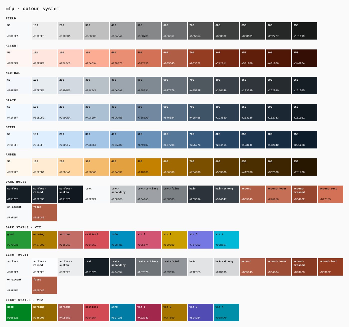
Author in sRGB hex. Ramps were derived in OKLCH so that steps are evenly spaced to the eye. CIELAB values are given for print matching. CMYK values are starting builds computed without a printer profile; proof them before a run.
### 1.2 Core palette
| Token | Hex | RGB | OKLCH (L C h) | CIELAB | CMYK start | Role | Production? |
|---|---|---|---|---|---|---|---|
| `field-50` | `#F8F9FA` | 248 249 250 | 0.982 0.002 248 | 98 -0 -1 | C1 M0 Y0 K2 | Paper: the page | measured, 38.0% of painted area |
| `slate-800` | `#2C3E50` | 44 62 80 | 0.356 0.039 249 | 25 -2 -13 | C45 M22 Y0 K69 | Slate: header, hero, bands | measured, 6.9% of painted area |
| `accent-600` | `#B05D45` | 176 93 69 | 0.571 0.114 37 | 49 32 29 | C0 M47 Y61 K31 | Terracotta: the accent | measured, 2.2% of painted area |
| `accent-700` | `#953D22` | 149 61 34 | 0.475 0.125 37 | 38 35 34 | C0 M59 Y77 K42 | Terracotta as text; small filled buttons | derived |
| `steel-600` | `#567798` | 86 119 152 | 0.557 0.064 249 | 49 -3 -22 | C43 M22 Y0 K40 | Steel: charts, quiet graphics | measured, 23.2% of text length |
| `amber-400` | `#E2A03F` | 226 160 63 | 0.753 0.135 73 | 71 16 58 | C0 M29 Y72 K11 | Amber: review stars only | measured |
Ink is `#151D25` (measured: 25.9% of text length, 8.6% of painted area). It is the `text` role in light mode and the `surface` role in dark mode.
### 1.3 Additions and why each exists
| Token | Value | Why |
|---|---|---|
| `text-secondary` | `#474D54` | Body copy that is not the main statement; 8.11:1 (AAA) on paper |
| `text-tertiary` | `#6E7378` | Replaces the two pale greys that failed contrast; smallest ink mix that clears 4.5:1 on paper (4.54:1 (AA)) |
| `accent-text` | `#953D22` | Terracotta is 4.43:1 (large text / non-text only) on paper, so terracotta text uses this darker step (6.71:1 (AA)) |
| `alias-accent-on-band` | `#D27155` | Terracotta kicker text on slate |
| `alias-accent-strong` | `#953D22` | Fill for buttons whose label is under 19 px bold |
| `alias-band-deep` | `#1B2733` | Under hero photographs and the footer |
### 1.4 Ramps
Slate (production value pinned at 800):
| 50 | 100 | 200 | 300 | 400 | 500 | 600 | 700 | 800 | 850 | 900 | 950 |
|---|---|---|---|---|---|---|---|---|---|---|---|
| `#F1F8FF` | `#E0EDF9` | `#C9D9EA` | `#ACC0D4` | `#8DA4BB` | `#7188A0` | `#576E84` | `#405468` | `#2C3E50` | `#23313F` | `#1B2733` | `#111921` |
Terracotta (production value pinned at 600):
| 50 | 100 | 200 | 300 | 400 | 500 | 600 | 700 | 800 | 850 | 900 | 950 |
|---|---|---|---|---|---|---|---|---|---|---|---|
| `#FFF5F2` | `#FFE7E0` | `#FFCEC0` | `#FDAC94` | `#E98E73` | `#D27155` | `#B05D45` | `#953D22` | `#742811` | `#5F1E09` | `#4E1706` | `#340E04` |
Neutral:
| 50 | 100 | 200 | 300 | 400 | 500 | 600 | 700 | 800 | 850 | 900 | 950 |
|---|---|---|---|---|---|---|---|---|---|---|---|
| `#F8F9FA` | `#EDEDEE` | `#D9D9DA` | `#BFBFC0` | `#A2A3A4` | `#868788` | `#6C6D6E` | `#535354` | `#3D3E3E` | `#303131` | `#262727` | `#181919` |
Use 50–200 for washes and rules, 400–600 for graphics, 700–950 for text and dark surfaces.
Palette sheet generated from tokens.json.
### 1.5 The second mode
Light is the primary mode for marketing, the portal and print. A dark mode is defined (ink surface `#151D25`, paper text) for the footer, the optional dark dashboard and night-time kiosk use. Switch with `data-mode="dark"`.
### 1.6 Status set
Status is never colour alone: each state has its own icon silhouette and a word.
| State | Light-mode colour | Icon | Word in the UI |
|---|---|---|---|
| Good | `#008321` | circle with check | Done |
| Warning | `#946900` | triangle | Needs attention |
| Serious | `#AC5853` | diamond | Problem found |
| Critical | `#D24B54` | octagon | Stop |
| Info | `#007CA5` | circle with i | Note |
Status colours are reserved. They are never chart series and never decoration.
### 1.7 Data-visualisation set
Single-series charts use `slate-400` with terracotta on the finding. When categories are needed, use these four in this order and no more:
| Series | Hex | Contrast on paper |
|---|---|---|
| 1 | `#A2274C` | 6.8:1 |
| 2 | `#A77600` | 3.81:1 |
| 3 | `#504CB4` | 6.57:1 |
| 4 | `#008FA9` | 3.62:1 |
The set was chosen by search so that the least separable pair still differs by ΔE 14.8 under simulated protanopia, deuteranopia and tritanopia (Machado 2009). A fifth series becomes "Other" in `text-faint`.
### 1.8 Contrast matrix (light mode)
| Foreground | On paper `#F8F9FA` | On raised `#FCFDFE` | On sunken `#EBECED` |
|---|---|---|---|
| text `#151D25` | 16.14:1 (AAA) | 16.71:1 (AAA) | 14.38:1 (AAA) |
| text-secondary | 8.11:1 (AAA) | 8.39:1 (AAA) | 7.22:1 (AAA) |
| text-tertiary | 4.54:1 (AA) | 4.7:1 (AA) | 4.05:1 (large text / non-text only) |
| text-faint | 2.83:1 (prohibited for text) | 2.92:1 (prohibited for text) | 2.52:1 (prohibited for text) |
| accent `#B05D45` | 4.43:1 (large text / non-text only) | 4.58:1 (AA) | 3.95:1 (large text / non-text only) |
| accent-text `#953D22` | 6.71:1 (AA) | 6.95:1 (AA) | 5.98:1 (AA) |
Paper text on the terracotta fill is 4.43:1. That passes for large text (19 px bold and up) and fails for smaller text, which is why small buttons use `accent-strong`. Paper text on slate `#2C3E50` is 10.6:1. The full matrix for both modes is in `tokens/report.md`.
### 1.9 Print colour
- Truck vinyl, yard signs and embroidery: match to the CIELAB values in `tokens/print.csv`, then confirm on a physical swatch. Vinyl and thread reference numbers are open items (15.7).
- Process print: start from the CMYK builds above, proof against the printer's profile, accept ΔE2000 ≤ 3 on slate and terracotta.
- Small ink text prints as 100 K, not a four-colour build.
- Paper: uncoated white stock for the door hanger and quote sheet, so the list can be written on.
### 1.10 Usage ratios
| Surface family | Paper and neutrals | Slate and ink | Terracotta | Status and chart colours |
|---|---|---|---|---|
| Marketing page | 60–75% | 20–35% | ≤ 2% | none |
| Portal | 85–92% | 6–12% | ≤ 2% | ≤ 2% |
| Dashboard | 85–92% | 6–10% | ≤ 0.5% | ≤ 6% |
| Social, ads | slate-led: 70–90% slate | n/a | ≤ 3% | none |
## 2. Logo, mark and usage
### 2.1 What the logo is
A gear with a crossed hammer and wrench, beside the name in two lines of capitals with a lowercase "c", over the descriptor "Handyman & Repairs". It is a **redraw** of the live raster logo, made for this system on 2026-11-16 and awaiting the owner's sign-off. The name is set in Plus Jakarta Sans ExtraBold and converted to outlines; the descriptor is DM Sans Bold. "Est. 2008" from the old badge is left out until the founding year is confirmed (15.7).
It is not a wordmark to retype, and the gear is not a decorative pattern.
The lockup, reversed on slate.
### 2.2 Files
| File | Colourway | Use |
|---|---|---|
| `logo/lockup-primary.svg` | Slate gear, ink name, terracotta descriptor | Paper and white backgrounds |
| `logo/lockup-reverse.svg` | White gear and name, light terracotta descriptor | Slate and ink backgrounds, photographs under the veil |
| `logo/lockup-ink.svg` | One colour, ink | One-colour print, fax, stamps |
| `logo/lockup-white.svg` | One colour, white | Embroidery on navy, cut vinyl on dark paint, email header |
| `logo/mark-slate.svg`, `mark-white.svg`, `mark-ink.svg` | Gear alone | Favicons, avatars, cap, tape measure, stickers |
| `logo/mark-app-slate.svg`, `mark-app-paper.svg` | Gear on a rounded square | App icon, social avatar |
| `logo/png/*` | Raster copies at 600–1600 px | Email, documents, reference for mockups |
| `logo/favicon/favicon-16…512.png` | App-icon mark | Favicon and touch icons |
Vendors always receive the SVG.
### 2.3 Clear space and minimum size
Clear space on every side equals the height of the capital "M" in the name. Nothing enters it.
| Medium | Lockup minimum width | Mark minimum |
|---|---|---|
| Screen | 120 px | 16 px |
| Digital and offset print | 1.25 in (32 mm) | 0.25 in (6 mm) |
| Screen print | 2 in (50 mm) | 0.5 in (13 mm) |
| Embroidery | 3 in (76 mm), descriptor dropped below 3.5 in | 0.75 in (19 mm) |
| Cut vinyl | 8 in (200 mm) | 2 in (50 mm) |
Below 120 px on screen, use the mark alone.
### 2.4 Placement
- Website and portal: top left, linking home.
- Print: bottom left as the sign-off, or top left on forms.
- Truck: centred on each front door; phone number beneath in ink or white; nothing else on the door.
- Uniform: left chest, 3.5 in wide, white thread on navy.
- Social images: bottom left; the URL or phone sits bottom right.
### 2.5 Do not
1. Retype the name in another font or weight.
2. Recolour the gear terracotta. The descriptor is the only terracotta part.
3. Put the primary lockup on slate or a photograph; use the reverse.
4. Add "#1", stars, or a slogan to the lockup.
5. Stretch, outline, shadow or tilt it.
6. Use the old grey raster file.
7. Let an image model redraw it: mockups use the supplied PNG, and vendors get the SVG.
## 3. Typography
### 3.1 Typefaces
| Role | Family | Weights | Source | Licence |
|---|---|---|---|---|
| Display | Plus Jakarta Sans | 700, 800 | Google Fonts; self-hosted variable file | SIL Open Font License 1.1: web, app, print |
| Reading and interface | DM Sans | 400, 500, 600, 700 | Google Fonts; self-hosted variable file | SIL Open Font License 1.1 |
| Numbers | DM Sans with tabular figures switched on | 400–800 | same | same |
Measured from the live site: both families are served as variable WOFF2 and every text element renders in one of them. There is no mismatch between requested and served fonts.
### 3.2 Measured metrics and what follows
| Face | Cap height | x-height | Ascender / descender | Avg width | Fallback `size-adjust` vs Arial |
|---|---|---|---|---|---|
| DM Sans | 0.700 em | 0.504 em | 0.992 / −0.310 | 0.522 em | 97% |
| Plus Jakarta Sans | 0.745 em | 0.536 em | 1.038 / −0.222 | 0.540 em | 103% |
- Body line-height floor is 1.30 (ascender plus descender); the system uses 1.65 for reading and 1.5 for interface text.
- Display line-height of 1.04–1.10 is a deliberate tight setting; headings need `overflow: visible`.
- DM Sans's default figures are proportional (tabular figures measured as not default), so `font-variant-numeric: tabular-nums` is set on `body`.
- Fallback faces are declared with the measured `size-adjust` so the layout does not shift while fonts load.
### 3.3 Marketing scale
| Token | Size | Line | Tracking | Weight | Use |
|---|---|---|---|---|---|
| `mk-hero` | clamp(40px, 5.2vw, 72px) | 1.04 | −0.03 em | 800 | The claim |
| `mk-h1` | clamp(34px, 4vw, 52px) | 1.08 | −0.025 em | 800 | Page titles |
| `mk-h2` | clamp(28px, 3.2vw, 46px) | 1.10 | −0.02 em | 800 | Section titles |
| `mk-h3` | clamp(21px, 2vw, 26px) | 1.25 | −0.01 em | 700 | Card and list titles |
| `mk-lead` | clamp(17px, 1.4vw, 20px) | 1.6 | 0 | 400 | Intro paragraphs |
| `mk-body` | 17px | 1.65 | 0 | 400 | Reading text |
| `mk-small` | 14px | 1.6 | 0 | 400 | Notes, legal |
| `mk-kicker` | 13px | 1.7 | +0.14 em, uppercase | 700 | Kickers and basis tags |
### 3.4 Product scale
Fixed pixels, every line-height a multiple of 4: 12/16, 14/20, 16/24, 20/28, 24/32, 32/40, 40/44, 52/56. Portal body text is 16/24; nothing in the portal is smaller than 12 px.
### 3.5 Rules
- Sentence case everywhere. Uppercase only through CSS on kickers and tags.
- Headings use `text-wrap: balance`; paragraphs use `pretty`; measure 45–75 characters.
- Numbers and their units are kept together with a thin space and `white-space: nowrap` ("60 min").
- Bold for the promise, never italics for emphasis, never underline except links.
- Print: body 10.5 pt minimum, legal 8 pt, nothing under 6 pt.
## 4. Layout, spacing, grids and image sizing
### 4.1 Spacing
Base unit 4 px. Scale tokens `space-1` (4) to `space-40` (160): 4, 8, 12, 16, 20, 24, 32, 40, 48, 64, 80, 96, 128, 160, plus `space-gutter` clamp(20px, 5vw, 64px). Measured on the live site: 20, 8, 10, 40, 80, 32, 24 are the most used; 10 and 15 are off-grid and are not carried forward.
Inside a component, gaps are no larger than its padding. Between components, gaps are at least the larger padding.
### 4.2 Grids
| Context | Container | Columns | Gutter | Notes |
|---|---|---|---|---|
| Marketing | 1200 px | 12 / 8 / 4 | 24 px | Reading text no wider than 720 px |
| Portal (mobile first) | 390 px reference | 4 | 20 px side margin | Primary action in the lower 40% |
| Dashboard | 1440 px | 12 | 12 px | Top bar 56, sidebar 232 |
| Letter print | 816 × 1056 px at 96/in | 6 | 60 px margin | 3 mm bleed, 5 mm safe |
Breakpoints: 360, 480, 760, 1024, 1280, 1440. At every width: 200% zoom works, content reflows at 320 px, tap targets are 48 × 48 px.
### 4.3 Radius and elevation
Radius: 8 (inputs), 12 (small cards), 16 (cards), 20 (photographs), full (buttons, chips). Measured on the live site: full, 16, 20, 12. Two shadows only, `shadow-card` and `shadow-lift`, on the portal and dashboard; marketing pages use hairlines.
### 4.4 Image sizing
| Surface | Aspect | Delivered size | Focal rule |
|---|---|---|---|
| Hero | 16:9 | 1920 × 1080, ≤ 300 KB | Subject in the right third; left 45% calm for type under the slate veil |
| Section | 3:2 | 1200 × 800, ≤ 160 KB | Subject centred |
| Portal thumbnail | 1:1 | 112 × 112 | The damage or the fixture fills the frame |
| Social | 1:1, 4:5, 9:16 | 1080 wide | Type on slate, not on the photo, unless veiled |
## 5. Components
### 5.1 Buttons
| Variant | Fill | Label | Height | Use |
|---|---|---|---|---|
| Primary | `accent` | `on-accent`, 19 px / 700 | 48 px min | The one action in the view: call, send, approve |
| Primary small | `accent-strong` | `on-accent`, 16 px / 700 | 40 px | Ad units and dense tables only |
| Ghost | none; 2 px `hair-strong` border | `text`, 19 px / 700 | 48 px | The second option beside a primary |
| Text link | none | `text` with a terracotta underline | n/a | Inline |
States: hover darkens the fill to `accent-hover`; active moves 1 px down; focus-visible shows a 3 px `focus` ring with 2 px offset; disabled drops to 45% opacity and loses the pointer; loading swaps the label for the busy bar and keeps the width.
### 5.2 Inputs
48 px tall, 16 px text, 1.5 px `hair-strong` border, 8 px radius, label always visible above (no placeholder-only labels). Error: border and message in `status-critical` with the octagon icon and a sentence that says how to fix it. The "add a photo" and "add another item" rows use a dashed border because they add rather than edit.
### 5.3 Cards and stat cards
Card: `surface-raised`, 1 px `hair`, 16 px radius, 24–32 px padding. Stat card: label (12/16, tertiary), figure (display numerals), one line of context. Exactly one stat card per view may carry the terracotta border and figure, and only when it is the finding.
### 5.4 Navigation
Marketing: logo left, four links, phone number right; on mobile the phone number stays visible and links collapse. Portal: bottom tabs (List, Quote, Visits, Account) with a terracotta dot on the active tab. Dashboard: slate top bar, light sidebar with the active item on a slate wash.
### 5.5 Tables, tags, feedback
Tables: uppercase 11–12 px headers, hairline rows, numbers right-aligned in tabular figures, a Source or Basis column on any table with promises or metrics. Basis tag: dot plus uppercase label. Toast: bottom centre, 200 ms in, says what happened ("Quote approved"). Empty state: one topic icon, one sentence, one action.
### 5.6 The signature element: the ticked list
The brand's own device is a checklist whose items tick as work is done. It appears as the portal's main screen, the door hanger's back, the notepad and the `punch-list` icon. The tick draws once (motion 8, chapter 16); it never bounces.
### 5.7 States checklist
Rest, hover, active, focus-visible, disabled, loading, error, selected, reduced motion, forced colours. A component is not finished until each is designed.
## 6. Websites and landing pages
### 6.1 The current site
Measured 2026-11-16: eight pages crawled (home, about, contact, projects, services, locations, two service pages). A dark hero with a truck photograph, a row of trust badges, six service cards whose images did not paint in the capture, a four-step process, reviews and FAQ. Defects are listed in the audit appendix.
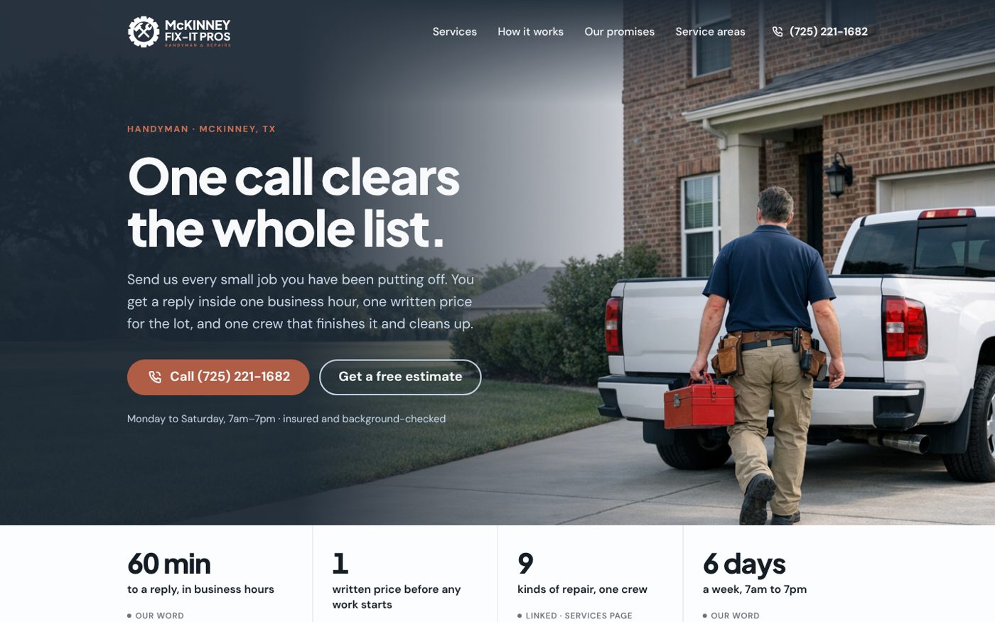
### 6.2 Landing page on the ladder
| Section | Rung | Content | Action |
|---|---|---|---|
| Nav | n/a | Logo, four links, phone | Call |
| Hero | 1 | The claim, one sentence of units, hours | **Call** (primary), Get a free estimate (ghost) |
| Proof row | 2 | 60 min · 1 price · 9 kinds · 6 days, each with a basis tag | none |
| Three fair questions | 3 | Will they show up? What will it cost? Will it be done right? | none |
| Services | 2 | Nine cards with mono icons | none |
| How it works | 3 | Four steps | none |
| How to check us | 3–5 | Promise table with basis; "When we have failed" | none |
| Closing band | 1 | "Your list will not fix itself." | **Call** |
| Footer | n/a | Areas, hours, legal line | none |
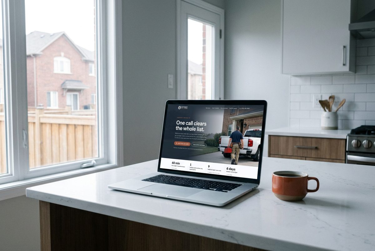
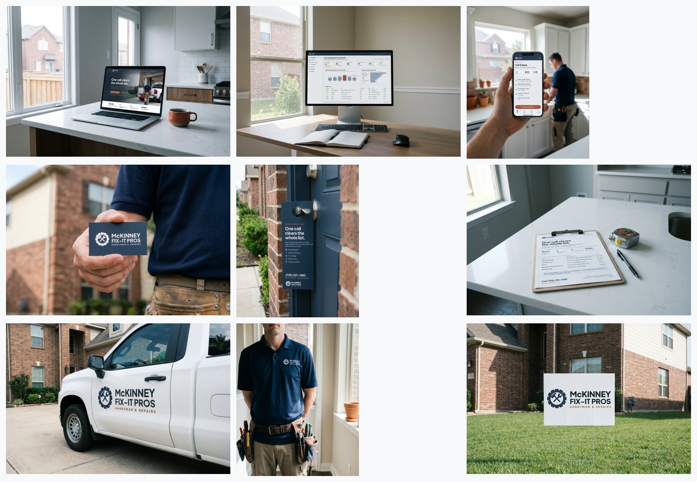
AI RENDER · CONCEPT. Landing page, first screen at 1440 × 900. The photograph is a concept render.AI RENDER · CONCEPT. The site on a laptop.
### 6.3 Site map
| Page | Rungs | One action |
|---|---|---|
| Home | 1–5 | Call |
| Services (index) | 2 | Call |
| One page per service (nine) | 1–3, with honest limits | Call |
| How it works | 3 | Send your list |
| Our promises | 3–5 | Ask for the certificate |
| Service areas | 2 | Call |
| Contact | 1 | Send your list |
Service pages state what a handyman should and should not do. The plumbing page reference build answers "Are you licensed plumbers?" with "No", and says what is referred out.
### 6.4 Technical rules
LCP ≤ 2.5 s, CLS ≤ 0.05, page ≤ 1.5 MB. Self-host the two variable fonts with the `size-adjust` fallbacks. Titles in sentence case with the town; descriptions ≤ 155 characters containing a unit. One `h1` per page. Organization and LocalBusiness structured data with the real phone, hours and service area. No carousels, no pop-ups on entry, no autoplay.
## 7. Functional apps
### 7.1 The customer portal
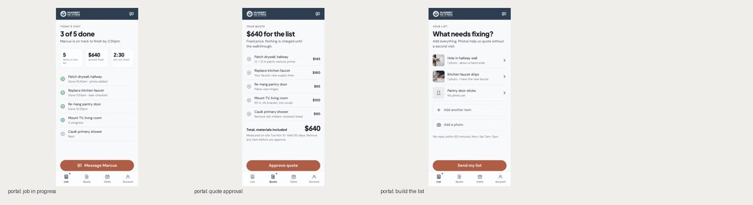
A phone-first web app. Each screen is named for the question the customer opens it to answer.
| Screen | Question | First thing shown | Primary action |
|---|---|---|---|
| Your list | What needs fixing? | Their items with photos | Send my list |
| Your quote | What will it cost? | One total, then each item and price | Approve quote |
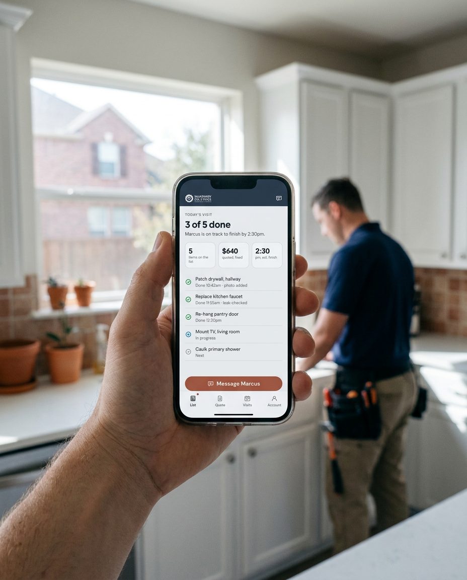
| Today's visit | Is my list getting done? | "3 of 5 done" and the finish time | Message the technician |
| Visits | When are you coming? | Next window, then history | Change time |
| Account | n/a | Address, contact, receipts | n/a |
Portal reference screens at 390 × 844. Figures are sample data.AI RENDER · CONCEPT. The portal on a phone.
### 7.2 Frame and patterns
Slate top bar 56 px with the reversed logo and a chat button. Content padding 20 px. Bottom tabs 72 px, four items. The primary button docks above the tabs. Patterns: verdict row of up to three stat cards; the ticked list; total line; dashed add rows; photo thumbnails.
### 7.3 States every screen handles
Loading (skeleton rows with shimmer), empty ("Nothing on your list yet. Add the first job."), partial (quote ready for some items), error (what failed and what to do), offline (changes saved on the phone and sent later), stale (time of last update shown).
### 7.4 Content rules
Prices in whole dollars. Times in 12-hour form with am/pm, no leading zero. Technicians by first name. Status words are fixed: Next, In progress, Done, Needs attention. Never "seamless", never an exclamation mark.
## 8. Dashboards (after Tufte)
### 8.1 Principles mapped to rules
| Principle | Rule here |
|---|---|
| Data-ink | No card backgrounds beyond one hairline; no gridlines unless a value is read from them |
| Chartjunk | No icons in charts, no gradients, no 3D, no gauges or donuts |
| Lie factor | Bars start at zero; the promise line is drawn at its true value |
| Small multiples | One small chart per technician rather than one chart with many colours |
| Words, numbers, pictures together | Chart titles state the finding; values are labelled on the marks |
| Integrity | Every panel names its unit, period, source and basis; sample data is labelled |
| Comparisons | Each figure sits beside what it should be (the 60-minute promise) |
| Content over interface | Filters are shown as text chips; no decorative chrome |
### 8.2 The dashboard as a document
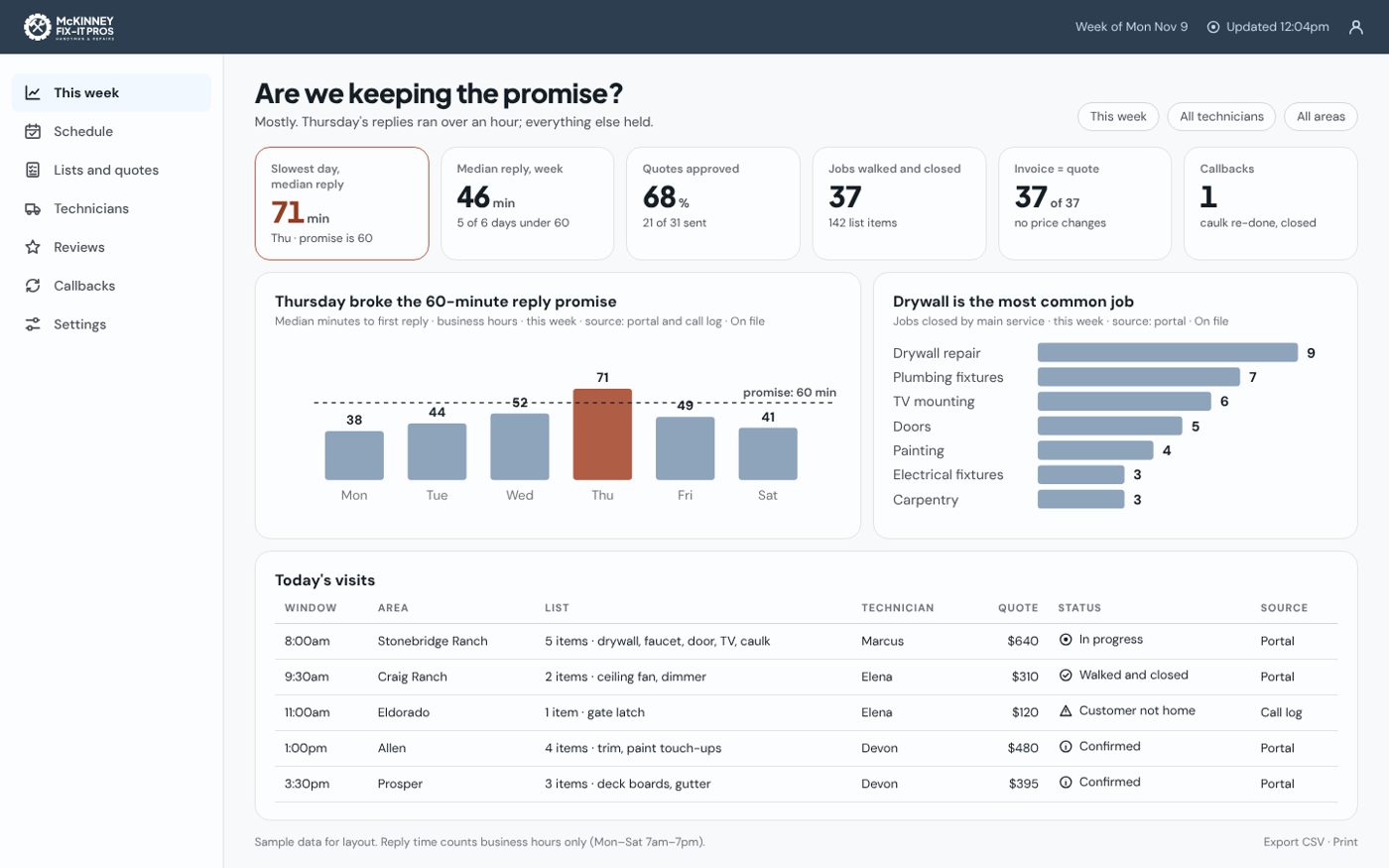
Title as a question ("Are we keeping the promise?") and a one-sentence answer → filter chips → verdict strip of six stat cards with exactly one terracotta finding → two evidence charts → today's visits table with a Source column → footer with definitions, freshness and export.
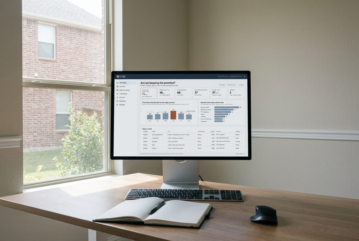
Owner dashboard reference at 1440 × 900. Sample data.AI RENDER · CONCEPT. The dashboard on a monitor.
### 8.3 What the owner dashboard measures
These are the brand's units turned into numbers: median minutes to first reply (business hours), quotes approved, jobs walked and closed, invoices equal to quote, callbacks. Reply time counts Monday to Saturday, 7am–7pm only.
### 8.4 Never
Gauges, donuts, dual axes, traffic lights without a word and an icon, a number without unit and source, animation on charts, a second terracotta element.
## 9. Data visualisation
| The data's job | Form | Not |
|---|---|---|
| Compare amounts | Sorted horizontal bars | Pie |
| Change over time | Line, up to four series, or small multiples | Stacked area |
| Against a promise | Bars or line with a dashed threshold line, labelled | Gauge |
| Part of a whole | One stacked bar | Donut |
| One number | Stat card | Chart |
Colour: single series in `slate-400`; the finding in terracotta; categories from 1.7 in fixed order. Marks: bars with 3 px radius, lines 2 px, labels 12 px minimum with a paper halo where they cross a line. Every chart has a title that states the finding, a subtitle with unit · period · source · basis, an `aria-label` with the finding, and a table alternative. Charts do not animate. In print, charts use ink and one terracotta mark.
## 10. Infographics, one-pagers, brochures, slides, documents
| Piece | Size | Structure |
|---|---|---|
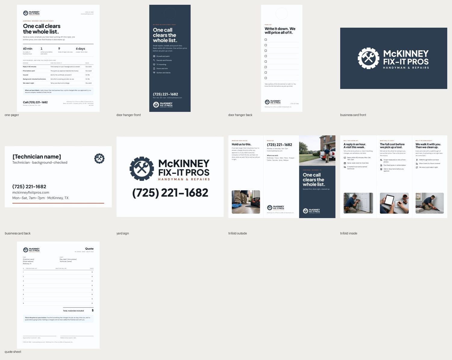
| One-pager | Letter portrait | Logo and contact → claim → four units → promise table → "When we have failed" → call line and legal |
| Trifold | Letter landscape, panels 3.67 / 3.67 / 3.60 in | Outside: test · contact · cover. Inside: the three fair questions in order |
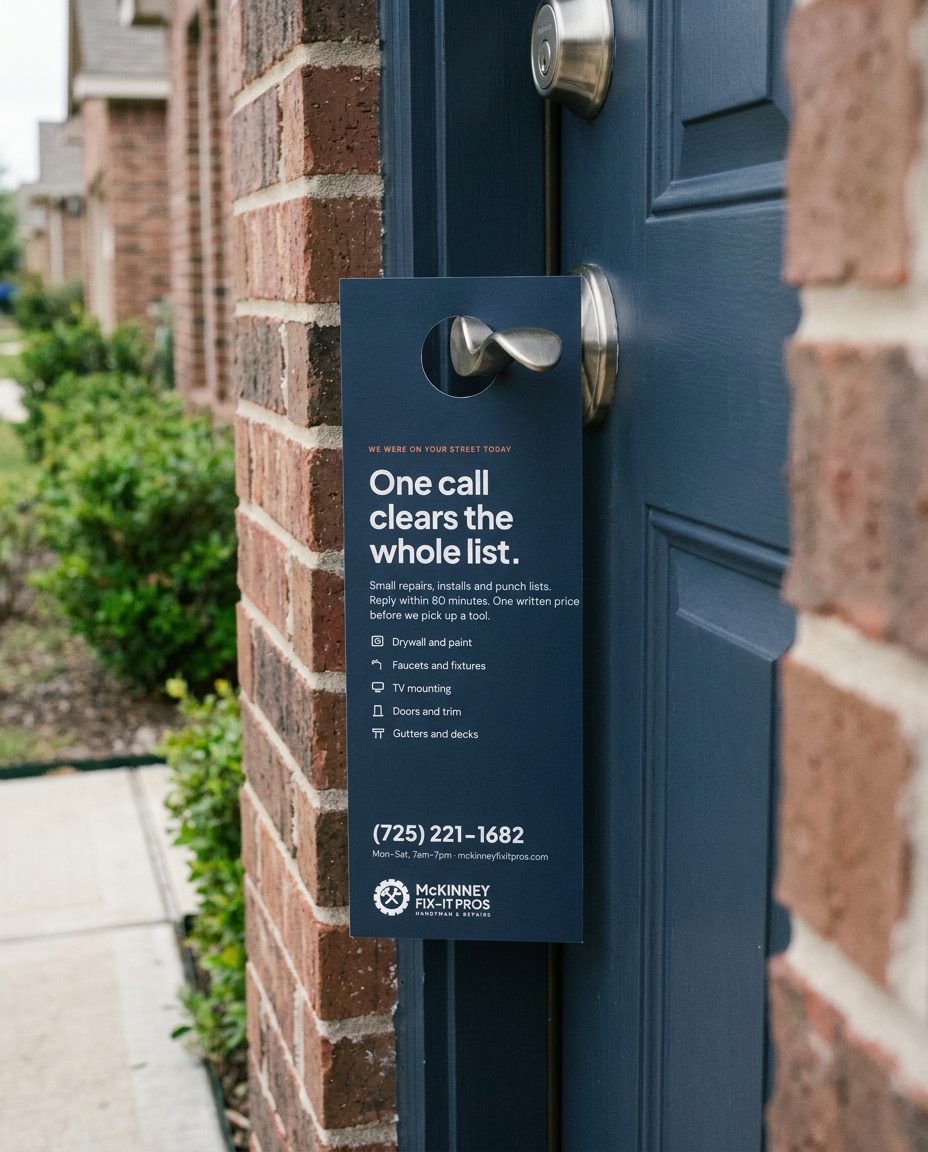
| Door hanger | 4.25 × 11 in, 1.25 in hole | Front: claim, five services, phone. Back: a blank ticked list to fill in |
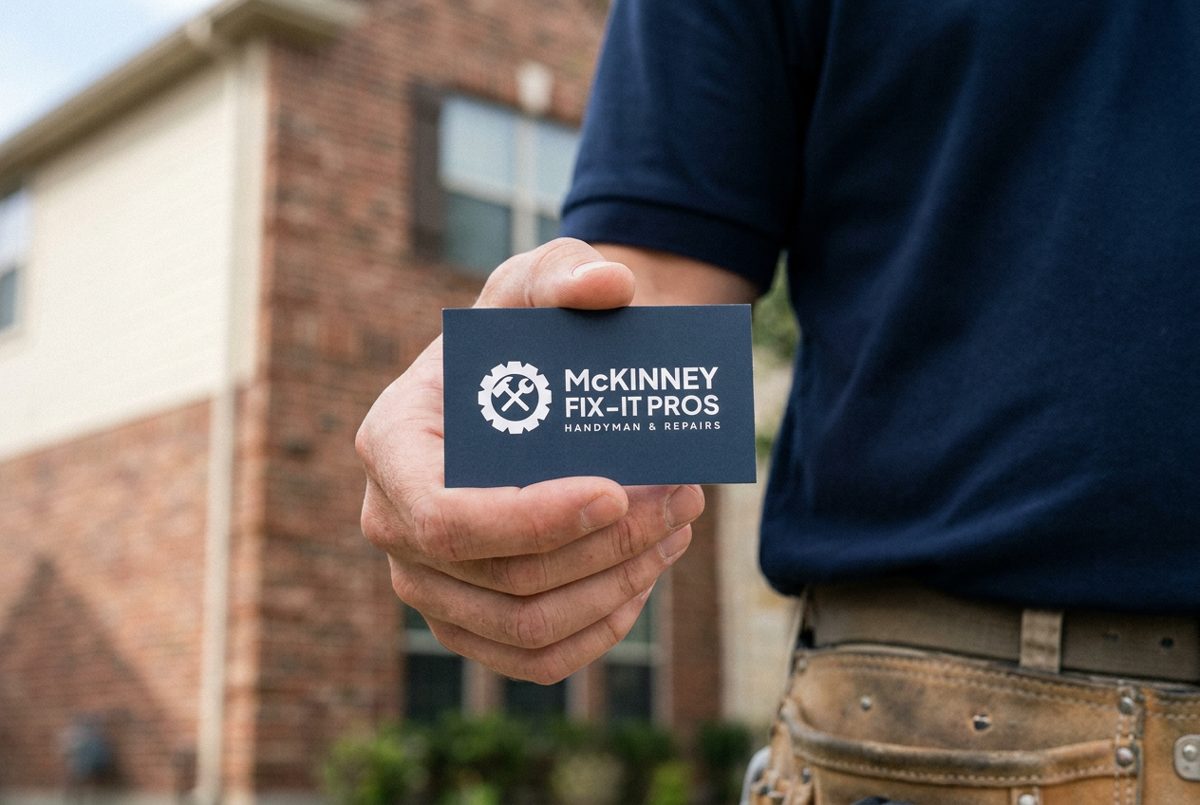
| Business card | 3.5 × 2 in | Front: reversed lockup on slate. Back: name, phone, hours, terracotta rule |
| Quote sheet | Letter portrait | Numbered list items, what we will do, price, total, the price promise, two signature lines |
| Yard sign | 24 × 18 in | Logo and phone number only |
| Slides | 16:9 | One claim per slide, 40 words at most |
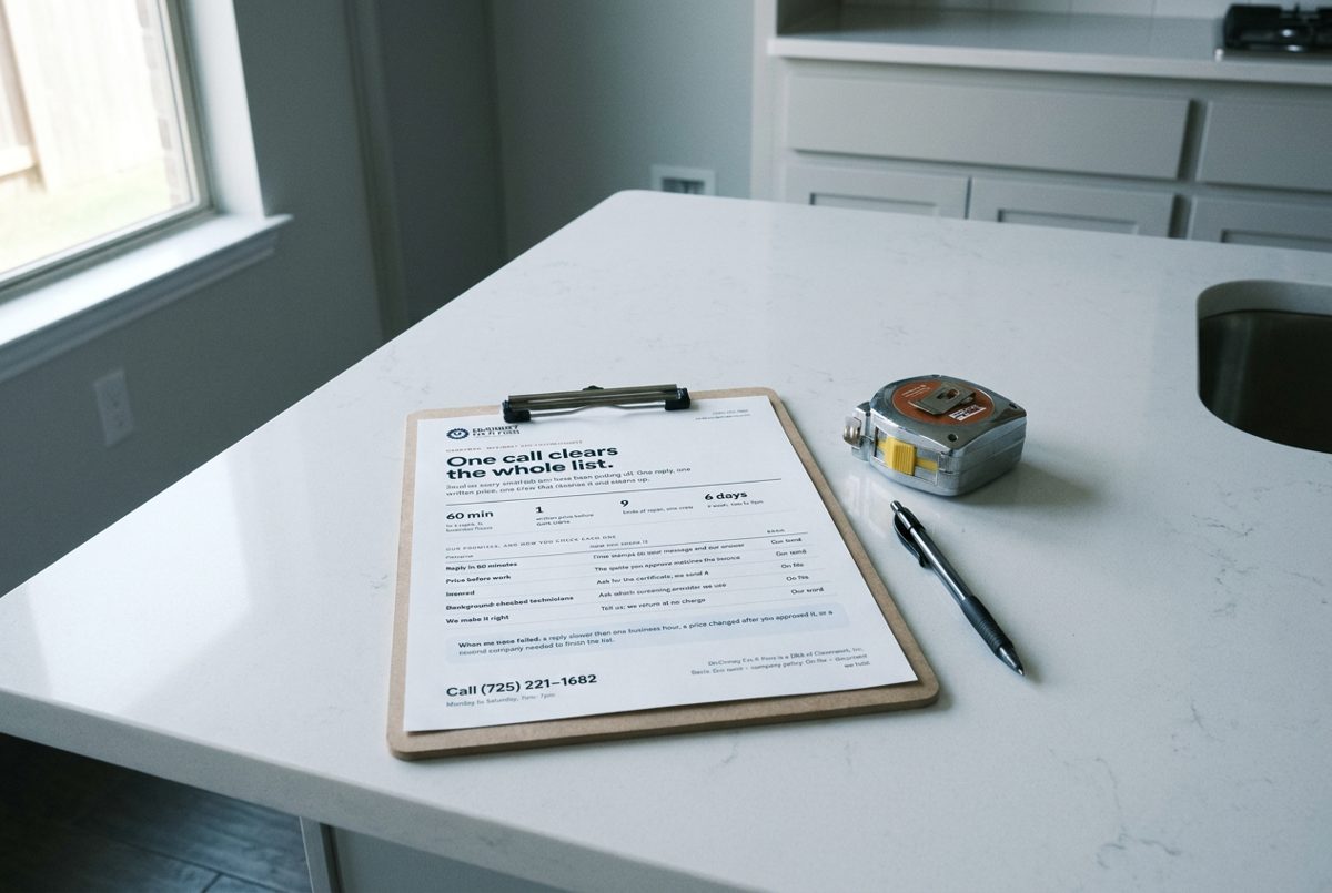
Print templates, flat renders.AI RENDER · CONCEPT. One-pager in use.AI RENDER · CONCEPT. Door hanger in use.AI RENDER · CONCEPT. Business card in use.
Pre-flight: trim, 3 mm bleed and 5 mm safe area set; images 300 ppi at placed size; small ink text 100 K; hairlines 0.25 pt or more; PDF/X-4; fill-in fields in brackets replaced or left as blanks on purpose.
## 11. Swag and physical objects
Objects carry the logo or the gear and nothing else. No slogans, no URLs, no patterns.
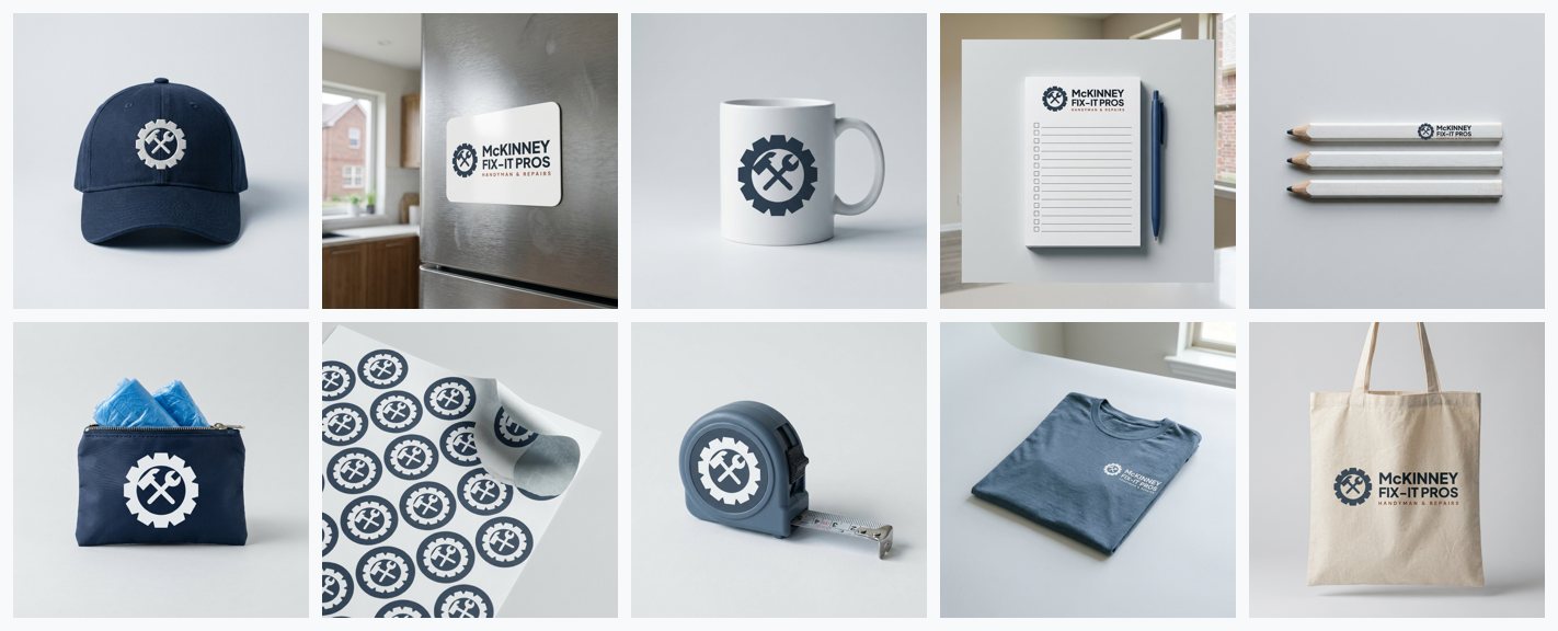
The renders below were generated on 2026-11-16 with fal.ai (`fal-ai/nano-banana-pro/edit`, the logo PNG passed as a reference). They are concepts for direction. Vendors receive the SVG masters; type drawn by an image model is never sent to a vendor. Every request is logged in `media/prompt_log.json`.
AI RENDER · CONCEPT. Swag concepts.
| Shot | Shows | Verdict |
|---|---|---|
| `swag-cap` | navy cap with the embroidered gear mark | Keep. |
| `swag-tee` | slate tee with the printed logo | Change: logo sits too low and too far right; place 3.5 in wide on the left chest. |
| `swag-mug` | white mug with the gear mark | Keep. |
| `swag-tape-measure` | slate tape measure with the gear mark | Keep. |
| `swag-pencil` | carpenter pencils with the logo | Keep. |
| `swag-magnet` | fridge magnet with the logo | Keep; add the phone number in production. |
| `swag-notepad` | punch-list notepad with the logo | Keep. This is the ticked list as an object. |
| `swag-tote` | canvas tote with the logo | Keep. |
| `swag-stickers` | sticker sheet with the gear mark | Keep. |
| `swag-shoe-cover-pouch` | shoe-cover pouch with the gear mark | Keep. |
### 11.1 Truck, uniform, yard sign
AI RENDER · CONCEPT. Vehicle, uniform, signage, device and print mockups.
| Shot | Shows | Verdict |
|---|---|---|
| `truck-door` | white work truck door with the logo decal | Keep (second attempt; the first redrew the logo and was rejected). Letter weight is slightly light; the sign shop works from the SVG. |
| `uniform-polo` | navy polo with the embroidered logo | Keep (second attempt; the first stacked the logo). Embroidery at this size drops the descriptor. |
| `yard-sign` | yard sign with the logo on a front lawn | Keep. Logo matches the master. |
| `device-phone-portal` | the customer portal on a phone in a kitchen | Keep. Screen matches the template. |
| `device-laptop-site` | the website on a laptop on a kitchen island | Keep. |
| `device-monitor-dashboard` | the owner dashboard on a desk monitor | Keep. Small text softened by the model; fine for direction. |
| `print-door-hanger` | the door hanger on a front door handle | Keep. |
| `print-business-card` | the business card held in a hand | Keep. |
| `print-one-pager` | the one-pager on a clipboard on a kitchen counter | Keep. Small text is softened; never use the render as artwork. |
### 11.2 Imprint specifications
| Item | Process | Artwork | Size and place | Colour |
|---|---|---|---|---|
| Truck door | Cut vinyl | `lockup-primary.svg` on white paint | 22 in wide, centred on the door, phone number 3 in cap height beneath | Slate and ink vinyl; descriptor in terracotta |
| Polo | Embroidery | `lockup-white.svg` | 3.5 in wide, left chest | White thread on navy |
| Cap | Embroidery | `mark-white.svg` | 2 in, front centre | White on navy |
| Tee | Screen print | `lockup-white.svg` | 3.5 in left chest | White ink on slate |
| Yard sign | Digital print on corrugated plastic | `templates/print/yard-sign.html` | 24 × 18 in, two sides | Slate, ink, terracotta on white |
| Carpenter pencil | Pad print | `lockup-ink.svg` | 2.5 in along the flat | One colour |
| Tape measure | Pad print or domed label | `mark-white.svg` | 1.25 in on the case side | White on slate |
| Magnet | Digital print | `lockup-primary.svg` + phone | 3.5 × 2 in | Full colour |
| Notepad | Digital print | Logo header, ruled checklist | 4.25 × 5.5 in, 50 sheets | Ink and terracotta |
| Mug | Ceramic print | `mark-slate.svg` | 2 in | Slate on white |
| Tote | Screen print | `lockup-ink.svg` | 8 in wide | One colour on natural canvas |
| Stickers | Die-cut vinyl | `mark-app-slate.svg` | 2 in round | Slate and white |
| Shoe-cover pouch | Screen print | `mark-white.svg` | 1.5 in | White on navy |
Navy garments are bought, not dyed to match: pick the stock navy closest to slate `#2C3E50` and confirm against a printed swatch.
## 12. Imagery, illustration and alt text
### 12.1 Photography rules
- **Subject:** hands and tools at the repair, the finished result, the truck at a brick home, the walkthrough. One idea per picture.
- **People:** technicians mid-task in a plain navy polo and work trousers; customers from behind or as hands. Nobody looks at the camera.
- **Place:** North Texas brick homes, builder-grade interiors, live oaks, big sky.
- **Light and grade:** daylight; neutral-cool; slate shadows; no golden wash, so terracotta stays the only warm brand colour.
- **Never:** handshakes, thumbs-up, hard hats, hi-vis, mess on floors, stock smiles.
- **Under type:** the slate veil, solid at the type side fading to clear, at 90–95% opacity.
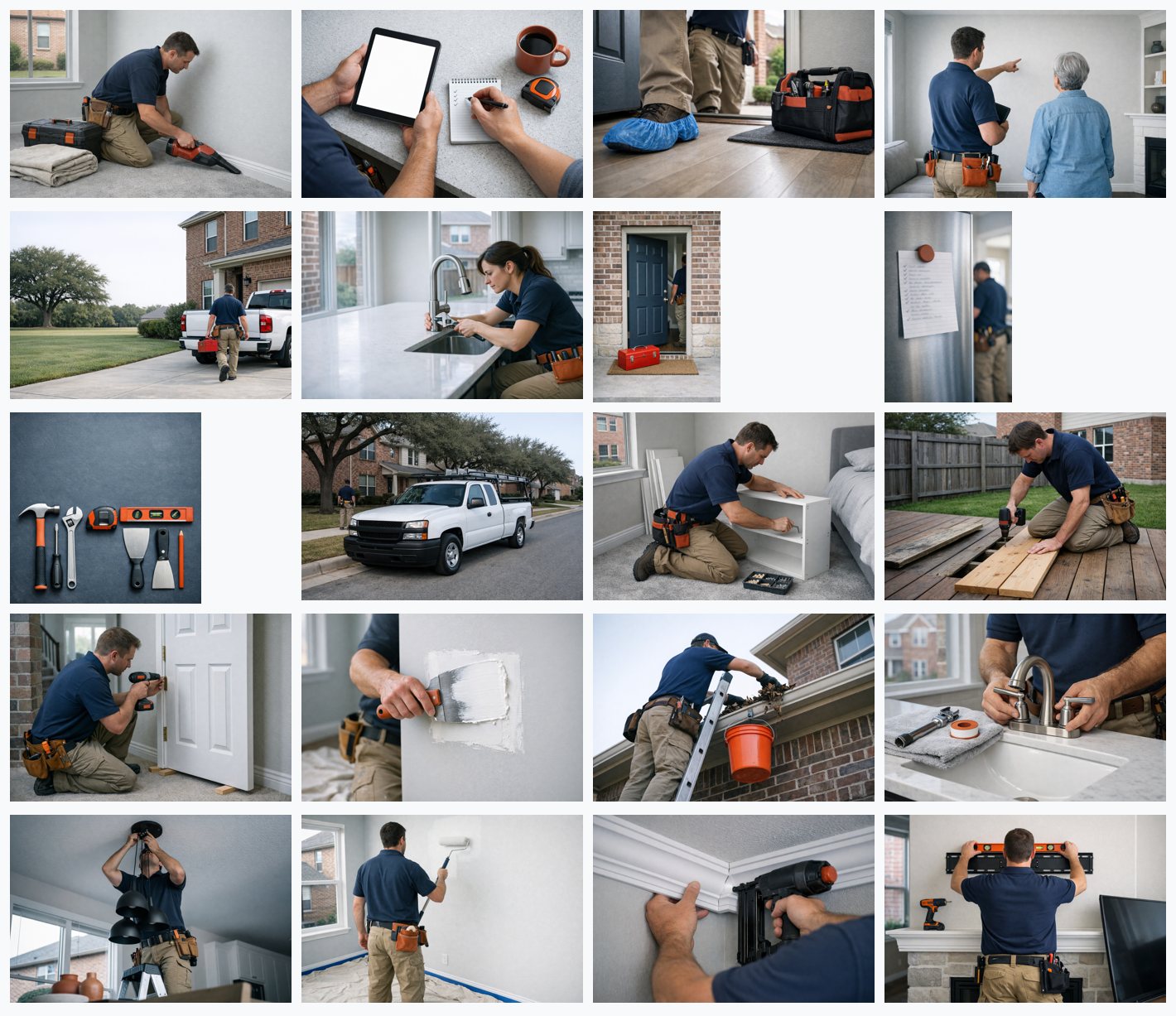
AI RENDER · CONCEPT. Photography direction, {len([s for s in SHOTS.values() if s["kind"]=="image"])} shots.
| Shot | Shows | Verdict |
|---|---|---|
| `hero-driveway` | a technician carries a toolbox from a white work truck toward a brick home | Keep. Reads as arrival; calm left side holds the claim. |
| `hero-kitchen` | a technician tightens a new kitchen faucet by window light | Keep. Real task, window light, no eye contact. |
| `svc-drywall` | a drywall knife smooths compound over a wall patch | Keep. |
| `svc-tv-mount` | a technician levels a TV bracket above a mantel | Keep. Level on the bracket says 'done right'. |
| `svc-faucet` | hands install a bathroom faucet on a white vanity | Keep. |
| `svc-door` | a technician fastens a door hinge with a drill | Keep. |
| `svc-paint` | a technician rolls paint onto a taped living-room wall | Keep. Tape lines and drop cloth visible. |
| `svc-light` | a technician on a step ladder fits a pendant light | Keep; check hands before any large use. |
| `svc-trim` | hands nail crown molding into a ceiling corner | Keep. |
| `svc-deck` | a technician replaces a board on a backyard deck | Keep. |
| `svc-exterior` | a technician clears leaves from a gutter on a brick house | Keep. |
| `svc-assembly` | a technician assembles a bookshelf with a hex key | Keep. |
| `care-shoe-covers` | work boots in blue shoe covers step onto a hardwood entry floor | Keep. The brand's best single picture of care. |
| `care-cleanup` | a technician vacuums along the baseboard after a repair | Keep. |
| `care-walkthrough` | a technician and a homeowner look over a finished wall together | Keep. Faces hidden as briefed. |
| `care-quote` | hands review a checklist and a tablet at a kitchen island | Keep. Blank tablet is right; never add fake UI. |
| `still-punch-list` | a ticked-off to-do list held to a refrigerator by a magnet | Keep; a second figure appears at the edge, crop to the list. |
| `still-tools` | hand tools laid in a tidy grid on a slate surface | Keep; tool grips are orange. Acceptable for tools, but do not treat orange as a brand colour. |
| `still-doorway` | a toolbox on the doormat of a brick home's front porch | Keep; a figure is visible inside the door, crop or veil. |
| `still-truck-street` | a white work truck parked on a street of brick homes | Change before use: older truck model than the hero; reshoot for consistency. |
### 12.2 Generated imagery policy
All photographs in v1.0 are concept renders made with fal.ai (`fal-ai/gpt-image-1.5`) on 2026-11-16; 39 requests succeeded and are logged with prompt, model, parameters and file hash in `media/prompt_log.json`. Each is labelled **AI RENDER · CONCEPT** wherever it is shown. They are never presented as photographs of real jobs, real technicians or real customers, and never used as a "project" or "before and after". Replace them with photographs of real work as those become available; the rules in 12.1 are the brief for that shoot.
### 12.3 Illustration
No illustrated characters. Diagrams use the icon set, 2 px lines and the slate ramp.
### 12.4 Alt text
| Case | Treatment |
|---|---|
| Decorative | `alt=""` |
| Informative | Up to 125 characters stating what matters, sentence case, no "image of" |
| Functional | States the action: `alt="call McKinney Fix-It Pros"` |
| Chart | The finding with units, plus a table alternative |
| Concept render | Ends with "(concept render)" when it is informative |
Test by reading the page with images off.
## 13. Accessibility, motion and interaction states
Target: WCAG 2.2 AA (recommended and confirmed). Many customers are older and on a phone, so the system goes further on size: body text 16 px or more on mobile, tap targets 48 px, phone numbers always tappable `tel:` links.
| Criterion | How it applies here |
|---|---|
| 1.4.3 Contrast | Only pairs from the matrix in 1.8; terracotta is never small text |
| 1.4.1 Use of colour | Status has an icon and a word; the active tab has a dot and bold text |
| 1.4.10 Reflow | 320 px without horizontal scrolling |
| 2.4.7 Focus visible | 3 px ring, 2 px offset, on every interactive element |
| 2.5.8 Target size | 48 px in the portal, 44 px minimum elsewhere |
| 2.3.3 / reduced motion | All durations become 0 ms; the tick appears drawn |
| 3.3.1 Errors | Message says what happened and how to fix it |
Test each release with keyboard only, a screen reader on the portal's three main screens, 200% zoom, and images off.
## 14. Voice and content
**Voice in one line: a capable neighbour who tells you the job, the price and the day.**
| Attribute | In practice |
|---|---|
| Plainspoken | "We replace the wax ring." Not "comprehensive toilet solutions." |
| Specific | A number or a noun in every claim: 60 minutes, one price, shoe covers |
| Neighbourly | "Your home", second person, no slang, no "guys" |
| Accountable | Say what happens when it goes wrong: "we come back and make it right" |
| Calm | No exclamation marks, no countdowns, no "act now" |
Canonical lines, never paraphrased:
- **One call clears the whole list.**
- **You know the full cost before we pick up a tool.**
| Use | Avoid |
|---|---|
| fix, punch list, quote, show up, clean up, walkthrough, technician, your home | #1, most trusted, best, seamless, solutions, guys, cheap |
| insured, background-checked | licensed (unless a licence number follows) |
Numbers: digits for everything measurable ("9 kinds of repair"); whole dollars; "60 minutes" in prose, "60 min" in figures; hours as "Mon–Sat, 7am–7pm". Sentence case in headings and buttons. Buttons start with a verb: Call, Send my list, Approve quote.
## 15. Governance
### 15.1 Source of truth
`tokens/tokens.json` (W3C design-token format) is the source. `tokens.css`, `color_math.json`, `print.csv` and `palette.html` are generated by `color_system.py` from `tokens/color-input.json` and `tokens/extra.json`; they are never edited by hand. Templates are generated by `templates/build_templates.py`. This document is generated by `docs_src/build_doc.py`.
### 15.2 Naming
`--mfp---`. Components use the role and alias tokens (`--mfp-text-secondary`, `--mfp-alias-band`), not raw ramp steps, except in charts.
### 15.3 Versioning
Major: a core colour, typeface or the logo changes. Minor: tokens or surfaces are added. Patch: corrections.
### 15.4 Change process
Propose the change with the surface it fixes → check it against the five laws → change the token or template source → regenerate → run `qa_check.py` → note it in the changelog.
### 15.5 Review checklist
- It answers one question.
- Ladder rungs in order; every number has a unit and a basis tag.
- One terracotta action per view.
- Tokens only; spacing on the 4 px grid.
- Contrast pairs from the matrix.
- Alt text on every image; concept renders labelled.
- Keyboard, focus, reduced motion, 200% zoom, 320 px checked.
- Logo from the SVG, right colourway, clear space kept.
- No avoided words; canonical lines untouched.
### 15.6 Defect classes
**Blocking:** contrast failure; status by colour alone; a number without a basis on a published surface; a concept render presented as a real job; "licensed" without a number. **Major:** off-token colour; a second terracotta element; a redrawn or misspelt logo. **Minor:** casing slips; one off-grid value.
### 15.7 Open items
| # | Item | Needed from |
|---|---|---|
| 1 | Sign-off on the redrawn logo | Owner |
| 2 | Founding year ("Est. 2008" on the old badge) | Owner |
| 3 | Review count with a linked platform | Owner |
| 4 | One sourced project count (the site shows both 500+ and 2,500+) | Owner |
| 5 | Phone number: (725) is a Nevada area code; consider a 214, 469 or 972 number | Owner |
| 6 | Certificate of insurance and screening provider on file, to support the "On file" tags | Owner |
| 7 | Postal address for the email footer | Owner |
| 8 | Social handles | Owner |
| 9 | Vinyl and thread reference numbers, confirmed on physical swatches | Sign shop, embroiderer |
| 10 | Real photography to replace concept renders | Photographer |
| 11 | The local repository uses navy `#1B2A46`, orange `#FF6B35` and Inter; this system follows the live site instead | Developer |
| 12 | Icons to refine in v1.1: hammer, shelf, trim | Designer |
| 13 | Technicians in the renders are not varied enough; widen in the next batch | Designer |
### 15.8 Changelog
- **v1.0 · 2026-11-16** First version. Measured from the live site; brief confirmed by the owner; logo redrawn; 72 icons; 39 concept renders; 32 templates.
## 16. Motion library
**Principle: done, not dazzling.** Motion confirms that something happened. Nothing loops except the busy bar and the skeleton shimmer.
| # | Class | What moves | Duration · easing | Where | Reduced motion |
|---|---|---|---|---|---|
| 1 | `mfp-m-hover` | Colour only | 150 ms · out | Buttons, links, rows | None |
| 2 | `mfp-m-press` | 1 px down | 150 ms · out | Buttons | None |
| 3 | `mfp-m-arrow` | Trailing arrow 3 px | 150 ms · out | Text links | None |
| 4 | `mfp-m-enter` | Fade and 4 px rise | 200 ms · out | Menus, tooltips | Appears |
| 5 | `mfp-m-sheet` | Slides up | 250 ms · in-out | Bottom sheets | Appears |
| 6 | `mfp-m-toast` | Fade and 8 px rise | 200 ms · out | Toasts | Appears |
| 7 | `mfp-m-reveal` | Fade and 12 px rise, once | 480 ms · out | Marketing sections | Shown |
| 8 | `mfp-m-tick` | The check draws | 250 ms · out | An item is done | Shown drawn |
| 9 | `mfp-m-count` | Value fades 40→100% | 200 ms · linear | A figure updates | None |
| 10 | `mfp-m-busy` | Bar travels | 1400 ms loop | Waiting without an end | Static bar |
| 11 | `mfp-m-shimmer` | Highlight travels | 1600 ms loop | Skeleton rows | Static |
Tokens: `dur-fast` 150 ms, `dur-base` 200 ms, `dur-slow` 250 ms, `dur-reveal` 480 ms; `ease-out` cubic-bezier(0.16, 1, 0.3, 1); `ease-in-out` cubic-bezier(0.65, 0, 0.35, 1). Never: counting-up numbers, parallax, carousels, chart draw-ins, autoplay video with sound. No video loops are part of v1.0.
```html
Call (725) 221-1682
```
## 17. Custom icon library
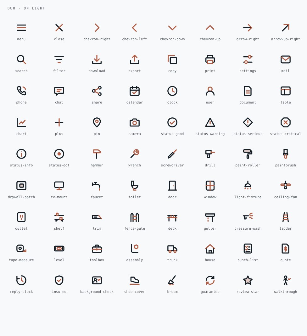
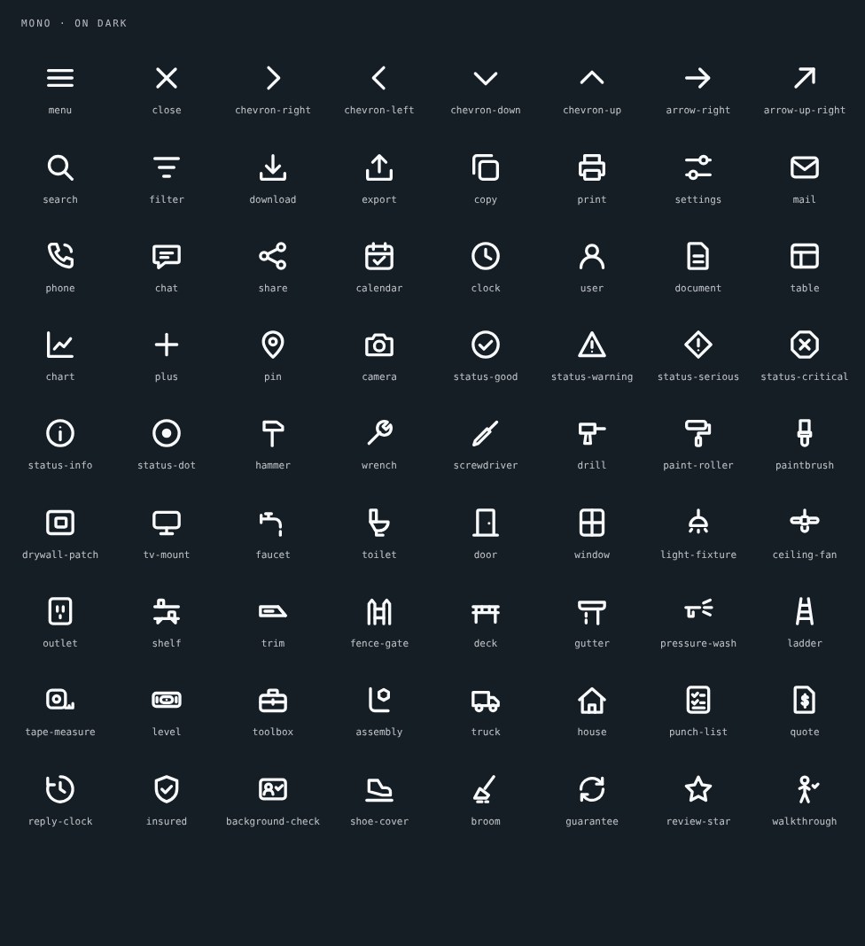
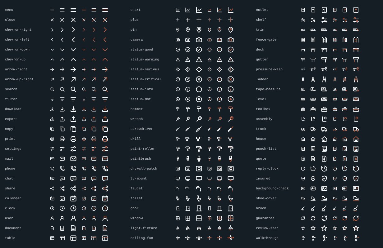
**Principle: icons label; they do not decorate.** 72 icons drawn for this company on a 24 px grid: 2 px stroke, round caps and joins, 2 px corner radius, no fills except dots. The 2 px weight follows the live site's icons (measured). Each ships as mono, duo and motion.
Duo set on paper.Mono set on ink.Sizes: 16, 20 and 24 px.
### 17.1 Interface (28)
| Name | Label | Meaning | Motion |
|---|---|---|---|
| `menu` | open the menu | — | draw |
| `close` | close | — | draw |
| `chevron-right` | next | — | draw |
| `chevron-left` | back | — | draw |
| `chevron-down` | expand | — | draw |
| `chevron-up` | collapse | — | draw |
| `arrow-right` | go | — | draw |
| `arrow-up-right` | opens elsewhere | — | draw |
| `search` | search | — | draw |
| `filter` | filter | — | draw |
| `download` | download | — | rise |
| `export` | send a copy | — | rise |
| `copy` | copy | — | draw |
| `print` | print | — | rise |
| `settings` | settings | — | pop |
| `mail` | email | — | draw |
| `phone` | call us | — | draw |
| `chat` | chat with us | — | draw |
| `share` | share | — | draw |
| `calendar` | schedule | — | draw |
| `clock` | time | — | draw |
| `user` | account | — | pop |
| `document` | document | — | draw |
| `table` | table | — | draw |
| `chart` | chart | — | draw |
| `plus` | add | — | draw |
| `pin` | service area | — | pop |
| `camera` | add a photo | — | pop |
### 17.2 Status (6)
| Name | Label | Meaning | Motion |
|---|---|---|---|
| `status-good` | done | — | draw |
| `status-warning` | needs attention | — | shake |
| `status-serious` | problem found | — | shake |
| `status-critical` | stop | — | draw |
| `status-info` | note | — | pop |
| `status-dot` | live | — | pulse |
### 17.3 Topic (38)
| Name | Label | Meaning | Motion |
|---|---|---|---|
| `hammer` | general repairs | the handyman: any small fix | shake |
| `wrench` | adjust and tighten | — | shake |
| `screwdriver` | install hardware | — | draw |
| `drill` | mounting and drilling | — | draw |
| `paint-roller` | interior painting | — | rise |
| `paintbrush` | paint touch-ups | — | draw |
| `drywall-patch` | drywall repair | a hole in the wall, made flat again | pop |
| `tv-mount` | TV mounting | — | draw |
| `faucet` | faucet and fixture installs | — | draw |
| `toilet` | toilet repair | — | draw |
| `door` | door installation | — | pop |
| `window` | window repair | — | draw |
| `light-fixture` | light fixture installs | — | blink |
| `ceiling-fan` | ceiling fan installs | — | pop |
| `outlet` | switches and outlets | — | draw |
| `shelf` | shelving | — | rise |
| `trim` | carpentry and trim | crown molding and baseboards | draw |
| `fence-gate` | fence and gate fixes | — | draw |
| `deck` | deck restoration | — | draw |
| `gutter` | gutter cleaning | — | flow |
| `pressure-wash` | pressure washing | — | blink |
| `ladder` | work at height | — | draw |
| `tape-measure` | measured before quoted | scope is measured, not guessed | draw |
| `level` | done right | straight, flush, plumb | pop |
| `toolbox` | one crew, many trades | — | draw |
| `assembly` | assembly | furniture and fixtures put together | pop |
| `truck` | we come to you | — | nudge-x |
| `house` | your home | — | draw |
| `punch-list` | the punch list | every item on your list, ticked | draw |
| `quote` | fixed quote | the full price before we pick up a tool | draw |
| `reply-clock` | reply within 60 minutes | — | draw |
| `insured` | fully insured | — | draw |
| `background-check` | background checked | — | draw |
| `shoe-cover` | we protect your floors | shoe covers on, floors protected | draw |
| `broom` | clean-up | we leave it cleaner than we found it | rise |
| `guarantee` | we come back and make it right | — | draw |
| `review-star` | customer review | — | pop |
| `walkthrough` | walkthrough | we check the finished work with you | draw |
### 17.4 Versions
| Version | Look | Use |
|---|---|---|
| Mono | One colour, inherits the text colour | Default in every interface |
| Duo | Slate or ink with the meaningful part in terracotta | One highlighted icon per view; or map `--icon-secondary` to `slate-400` when several appear together |
| Motion | The meaningful part moves once | When a state changes: a tick draws, a warning shakes |
```html
…inline icons/duo/mfp-quote.svg…
```
The motion preview is `icons/preview.html`. To add an icon: draw it on the grid in `icons/icon-spec.json`, give it a primary and a secondary layer and a motion, rebuild with `build_icons.py`, and check it at 16 px on paper and on ink. The library has no emoji, no other companies' marks and no icon for a service that is not offered.
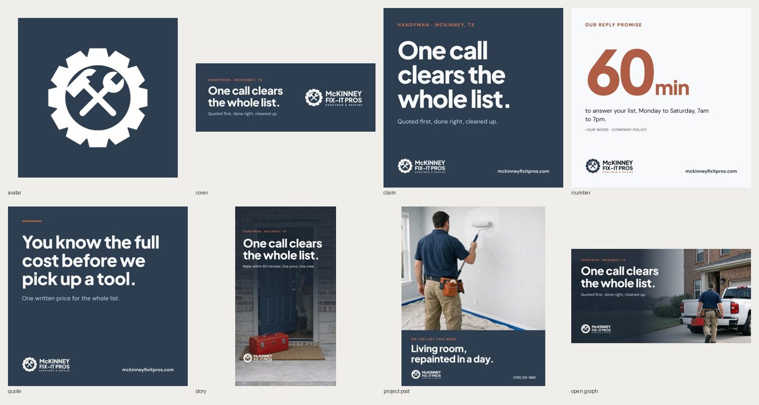
## 18. Social library
**Principle: one idea per post, on slate, with the logo bottom left.**
Social templates.
| Asset | Size (px) | Template | Notes |
|---|---|---|---|
| Avatar | 320 × 320 | `avatar-320` | Gear on slate; keep inside the central 72% for circular crops |
| Facebook cover | 820 × 312 | `facebook-cover-820x312` | Mobile shows the central 640 px |
| Claim | 1080 × 1080 | `claim-1080` | The claim at 146 px |
| Number | 1080 × 1080 | `number-1080` | One figure in terracotta with its unit and basis tag |
| Quote | 1080 × 1080 | `quote-1080` | A canonical line on the terracotta rule |
| Story | 1080 × 1920 | `story-1080x1920` | 250 px clear top and bottom |
| Project post | 1080 × 1350 | `project-1080x1350` | Use a real job photo; the render is a placeholder |
| Link image | 1200 × 630 | `open-graph-1200x630` | Site Open Graph |
Sizes were checked in September 2026 by the skill's reference; re-check before a campaign. Channels: Facebook, Instagram, Nextdoor, Google Business Profile. Profile fields identical on each: name "McKinney Fix-It Pros", bio "One call clears the whole list. Small home repairs in McKinney and Collin County. Mon–Sat, 7am–7pm.", phone, link. Type never under 28 px on a 1080 px image. No hashtags in images; two at most in captions. A number in a post carries its basis in the caption. Regenerate with `python templates/build_templates.py` and `render.py`.
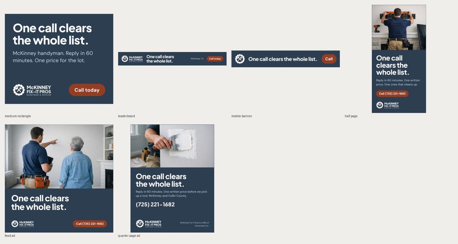
## 19. Advertising library
**Principle: one claim, one verb, the logo once, terracotta once.**
Advertising templates.
| Unit | Size | Template | Notes |
|---|---|---|---|
| Medium rectangle | 300 × 250 | `iab-300x250` | Exported at 2× |
| Leaderboard | 728 × 90 | `iab-728x90` | |
| Mobile banner | 320 × 50 | `iab-320x50` | Mark, claim, "Call" |
| Half page | 300 × 600 | `iab-300x600` | The smallest unit that may carry a photograph |
| Meta feed | 1080 × 1080 | `meta-feed-1080` | |
| Quarter-page print | 4.25 × 5.5 in | `print-quarter-page` | Legal line 8 pt minimum |
| Door hanger | 4.25 × 11 in | `print/door-hanger-*` | Chapter 10 |
| Yard sign | 24 × 18 in | `print/yard-sign` | Chapter 10 |
Small units use the `accent-strong` button because the label is under 19 px. Static first; if animated, 15 seconds at most, fades only, no sound. Each digital unit gets a UTM; each print piece gets its own tracking phone extension or short URL. The claim is used word for word at every size.
## 20. Email
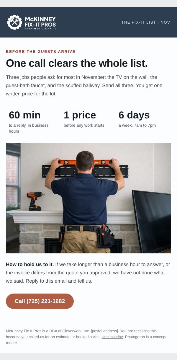
**Principle: one job for the reader, one button.**
Anatomy: hidden preheader → slate header with the white logo and the issue label → kicker and the claim → three figures in text → one photograph → "How to hold us to it" → one button → footer with the legal line, postal address, reason for receipt and unsubscribe.
AI RENDER · CONCEPT. Newsletter reference build at 600 px. The photograph is a concept render.
Technical rules: 600 px; nested tables with `role="presentation"`; every style inline, written as hex because email clients ignore CSS variables; the layout holds in Arial; table-cell button 52 px tall; figures as text, never only in an image; plain-text twin (`templates/email/newsletter.txt`); HTML under 100 KB. Subject line 50 characters at most, sentence case, no exclamation mark. Cadence: monthly "fix-it list", plus a review request after every job. Test in Gmail, Apple Mail and Outlook, in light and dark, before each send.
## Appendix A. Token reference
Every token with its value is in `tokens/tokens.json`; the CSS custom properties are in `tokens/tokens.css`; print values are in `tokens/print.csv`; the full contrast matrix and the colour-vision report are in `tokens/report.md`.
## Appendix B. Live-site audit
1. **Logo is raster only.** Header logo is a 350×154 WebP (light grey, transparent). No SVG master on the site; favicon/apple-touch are the same lockup squeezed to 180×79 (not square).
2. **Two accents compete.** Terracotta #B05D45 (CTAs, eyebrows, 2.2% painted area) and amber #E2A03F (hero word "Handyman", eyebrow, stars) both ask for attention in the hero.
3. **Service card images did not paint** in the full-page capture of the home page (alt text shown on #CDD8E3 placeholders). May be lazy-loading; verify in a real browser.
4. **Phone number (725) 221-1682 is a Nevada area code** on a McKinney, TX business. Reads as non-local / call-tracking to a sceptical homeowner.
5. **"Licensed" claim.** Site says "licensed, insured, background-checked". Texas has no state handyman licence; plumbing and electrical work require state licences. The plumbing page FAQ asks "Are you licensed plumbers?" — claim needs a licence number or rewording.
6. **Proof numbers unsourced.** "100+ five-star reviews", "500+ projects", "Since 2008 / 15+ years", "60-minute response". No review platform linked; no independent listing surfaced in a web search on 2026-11-16.
7. **Low-contrast text.** #8BA4BE and #9BB1C8 on #F8F9FA/#FFFFFF carry ~20% of text; both fail WCAG AA for body text (≈2.6:1 and ≈2.2:1).
8. **Meta defects.** Service page descriptions end "Free estimates. Free estimates."
9. **Fonts.** DM Sans (reading) and Plus Jakarta Sans 800 (display) are served and render; hashed family names, Arial fallbacks registered. No mismatch.